HISTORICAL PIGMENT ARCHITECTURE
Höpfner's Discovery & Rowney's Victorian Commercialization
In 1805, Swiss-born German chemist Albrecht Höpfner synthesized a novel turquoise-blue inorganic compound while investigating the thermal calcination of cobalt oxide and tin oxide. However, the discovery languished as a laboratory curiosity for over half a century due to high manufacturing costs.
In 1860, the English artist colormaker George Rowney & Co. in London refined the industrial synthesis and introduced the pigment commercially under the Latin trade name 'Coeruleum' (from *caelum*, meaning sky or heaven).
Cerulean Blue (Color Index PB35) instantly gained international acclaim among watercolorists and landscape painters, providing an unalterable, opaque sky-blue that did not shift toward green under artificial gaslight—a chronic defect of Prussian and Indigo blues.
CHEMICAL SPECIFICATION & OPTICAL DATA
Cobalt Stannate Spinel Lattice & Spectral Physics
Cerulean Blue (Color Index PB35) is an inorganic mixed-metal oxide formulated as cobalt(II) orthostannate (Co₂SnO₄), crystallizing in an inverse spinel structure. In this lattice, Co²⁺ ions occupy octahedral coordination sites within a close-packed tin-oxygen framework.
The crystal field transitions of Co²⁺ within the stannate lattice generate strong reflectance across the cyan-blue waveband (470 nm to 490 nm) while absorbing yellow and orange wavelengths (580–620 nm). A slight secondary transmission in the green spectral region gives Cerulean its characteristic cool, greenish-azure undertone.
Carrying an ASTM Class I lightfastness rating, PB35 is virtually indestructible: impervious to strong acids, alkalis, high heat, and intense solar radiation. Due to its high specific gravity and large particle size, it exhibits heavy, distinct flocculation and granulation in watercolor mediums.
ART HISTORICAL HERITAGE
Impressionist Heritage: Monet, Sisley, and Berthe Morisot
The Impressionist painters adopted Cerulean Blue as a foundational color for plein-air landscape painting. Claude Monet and Alfred Sisley utilized PB35 to render the pale, sun-bleached summer skies along the Seine, contrasting its cool opacity against warm cadmium and ochre fields.
Berthe Morisot famously used Cerulean Blue in 'Summer's Day' (1879) to paint the shimmering water and delicate fabrics, leveraging its unique semi-opaque chalkiness to capture shifting Parisian light.
Cerulean Blue represents open celestial space, serene atmospheric clarity, and unwavering physical permanence.
STUDIO CRAFT & MATERIAL PRACTICE
Atelier Execution: Heavy Mineral Granulation & Wax Resist Borders
In the Coloartura studio in Ermelo, genuine Cerulean Blue PB35 is milled into saturated watercolor glazes on 300gsm cold-pressed cotton rag paper.
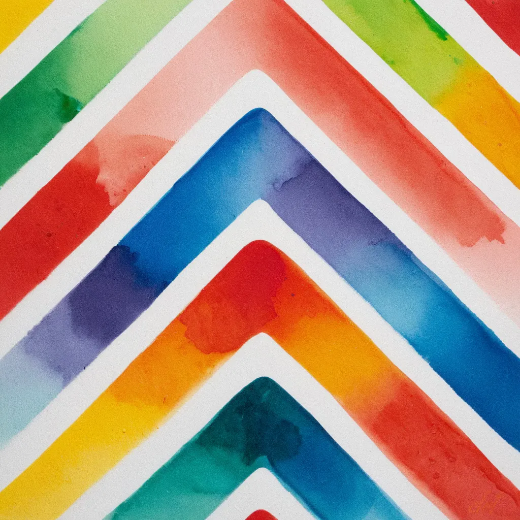
Because of its dense, heavy mineral particles, Cerulean Blue precipitates dramatically into the textured hollows of the cotton paper, creating a mottled, sky-like granulation pattern. When bordered by wax crayon resist lines, the pigment clusters tightly along the paraffin boundaries, producing crisp geometric borders in Coloartura's 1:1 masterworks.